
A cafe’s interior often decides whether guests stay for one coffee or come back every week. That’s exactly why so many cafe owners now choose 10×10 decorative mosaic tiles for their walls, counters, and accent corners. This small format creates a detailed, textured look that instantly feels curated and intentional. Moreover, it fits tight bar counters, narrow pillars, and feature walls without awkward cuts or wasted material. In this guide, we first explore which tile styles suit a cafe’s atmosphere. After that, we walk through five specific products that pair beautifully with modern cafe themes. So, let’s dive straight into the design side.
What Mosaic Ceramic Tiles Style Works Best for a Cafe?
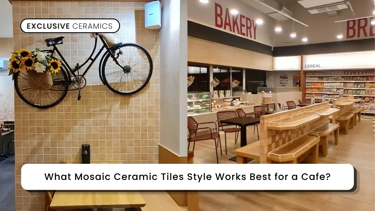
Not every tile style fits a cafe’s relaxed, social atmosphere. Generally, the right 10×10 decorative mosaic tiles balance visual interest with a calm, welcoming feel. Here are six style directions that consistently work for cafe interiors.
1. Industrial Grey Tones
Grey tones bring a raw, urban edge that suits coffee shops with exposed ceilings. Meanwhile, this palette pairs naturally with black steel furniture and pendant lighting. As a result, industrial grey remains a favorite among specialty coffee brands.
2. Warm Rustic Terracotta
Terracotta tones add instant warmth to a cafe’s counter or accent wall. Consequently, this style suits spaces that lean toward a cozy, homey vibe. Additionally, warm brown tones photograph beautifully under soft, ambient lighting.
3. Calming Blue Accents
Blue tones create a fresh, relaxed mood that slows guests down. Therefore, this color works well in cafes that want a laid-back, coastal feel. Even in small doses, a blue accent wall becomes an instant photo spot.
4. Botanical Green Highlights
Green tones connect naturally with indoor plants and biophilic design trends. In fact, this palette suits cafes that lean into a fresh, garden-inspired concept. Since green stays versatile, it also blends with both wood and white interiors.
5. Textured Wavy Surfaces
A wavy, contoured surface adds tactile depth that flat tiles simply can’t offer. Thus, this texture works beautifully as a statement wall behind the barista counter. Guests often notice textured walls first, which helps with brand memorability.
6. Mixed Motif Mosaic Layouts
Combining two or three colors in one wall creates a lively, artistic focal point. However, this approach works best when the base palette still stays cohesive. This way, the 10×10 decorative mosaic tiles feel curated instead of chaotic.
The Best 10×10 Decorative Mosaic Tiles for Cafe
Now that the style direction is clear, here are five specific picks worth exploring. Each one connects a distinct 10×10 decorative mosaic tiles option to a popular modern cafe style.
1. Green Verde
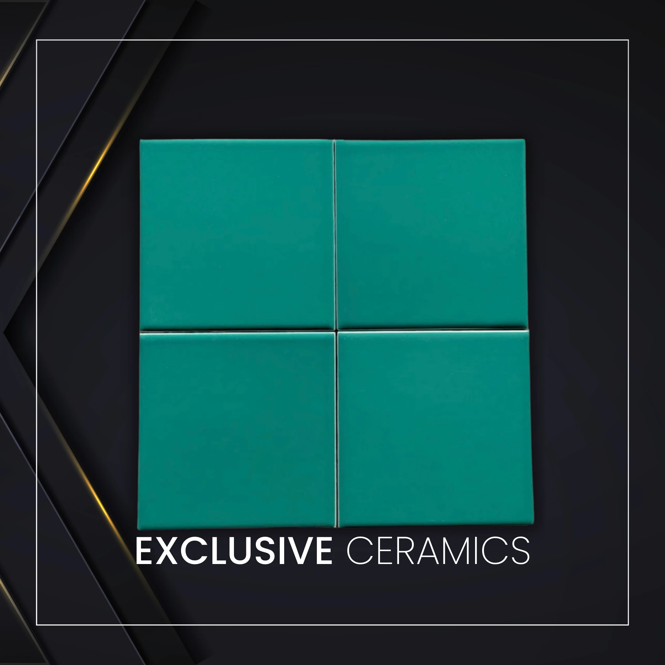
Green Verde carries a random natural motif in a rich, elegant green tone. This shade fits beautifully into a botanical or garden-themed cafe concept. Because green already pairs so well with indoor plants, it strengthens a fresh, biophilic atmosphere without extra effort. Furthermore, the matte satin finish keeps the surface easy to wipe near the counter, where spills happen often.
Many modern cafes now use a green accent wall as the backdrop for their signature drink display, and this tile fits that role perfectly. Altogether, Green Verde suits owners who want their space to feel alive, organic, and Instagram-ready. See the full details here: Green Verde 10×10.
2. Blue
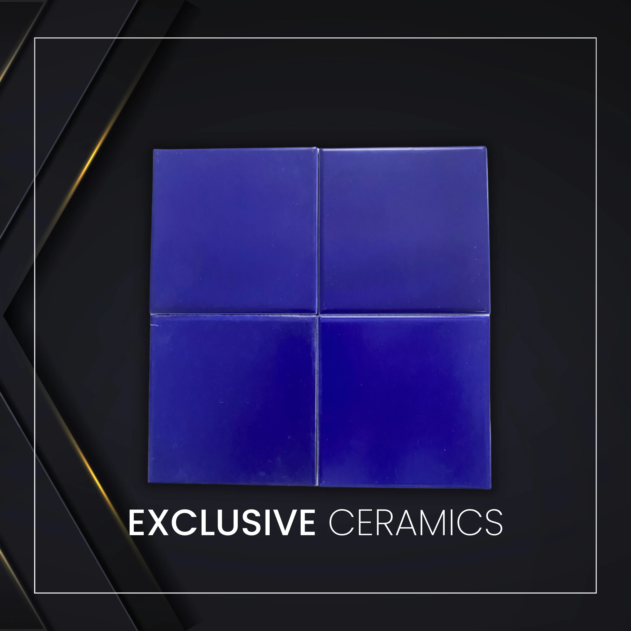
Blue brings a calming, random natural motif that softens even a busy coffee bar. This tone works especially well in coastal-inspired or minimalist Scandinavian cafe concepts. Since blue naturally slows the eye down, it helps create a relaxed seating area where guests want to linger longer.
Additionally, the matte satin finish resists daily splashes near the espresso machine and sink. Cafes that lean into a calm, “third place” identity often choose blue precisely for this soothing effect. As a result, Blue remains a strong pick whenever the goal is a peaceful, unhurried cafe atmosphere. Explore the specification here: Blue 10×10.
3. SB-4016
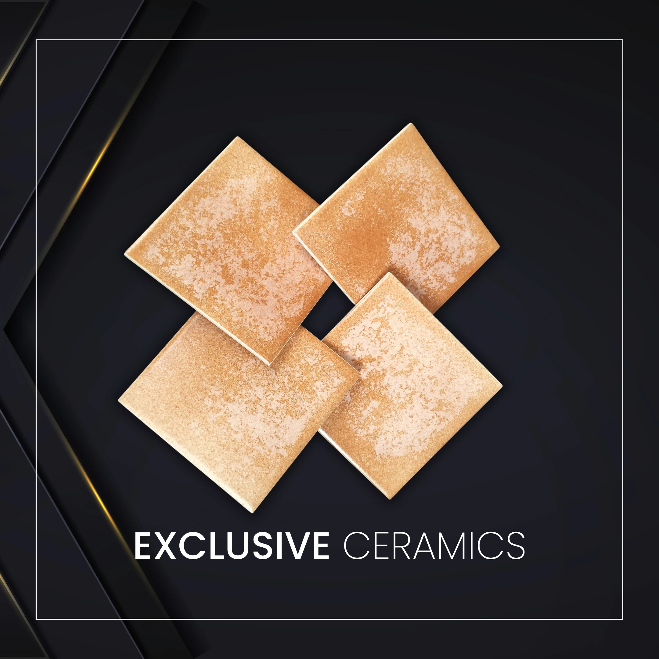
SB-4016 features a warm terracotta brown motif with a flat matte satin surface. This earthy tone fits naturally into rustic, farmhouse-style, or Mediterranean-inspired cafe interiors. Because terracotta already carries a handmade, artisanal feel, it pairs beautifully with wooden stools, rattan lighting, and exposed brick.
Moreover, the flat texture keeps installation simple around counters and straight accent walls. Cafes aiming for a warm, “grandma’s kitchen” nostalgia often gravitate toward this exact tone. Therefore, SB-4016 suits any concept built around comfort, warmth, and a slower, homier pace. Check the listing here: SB-4016 10×10.
4. Tobago Rosato
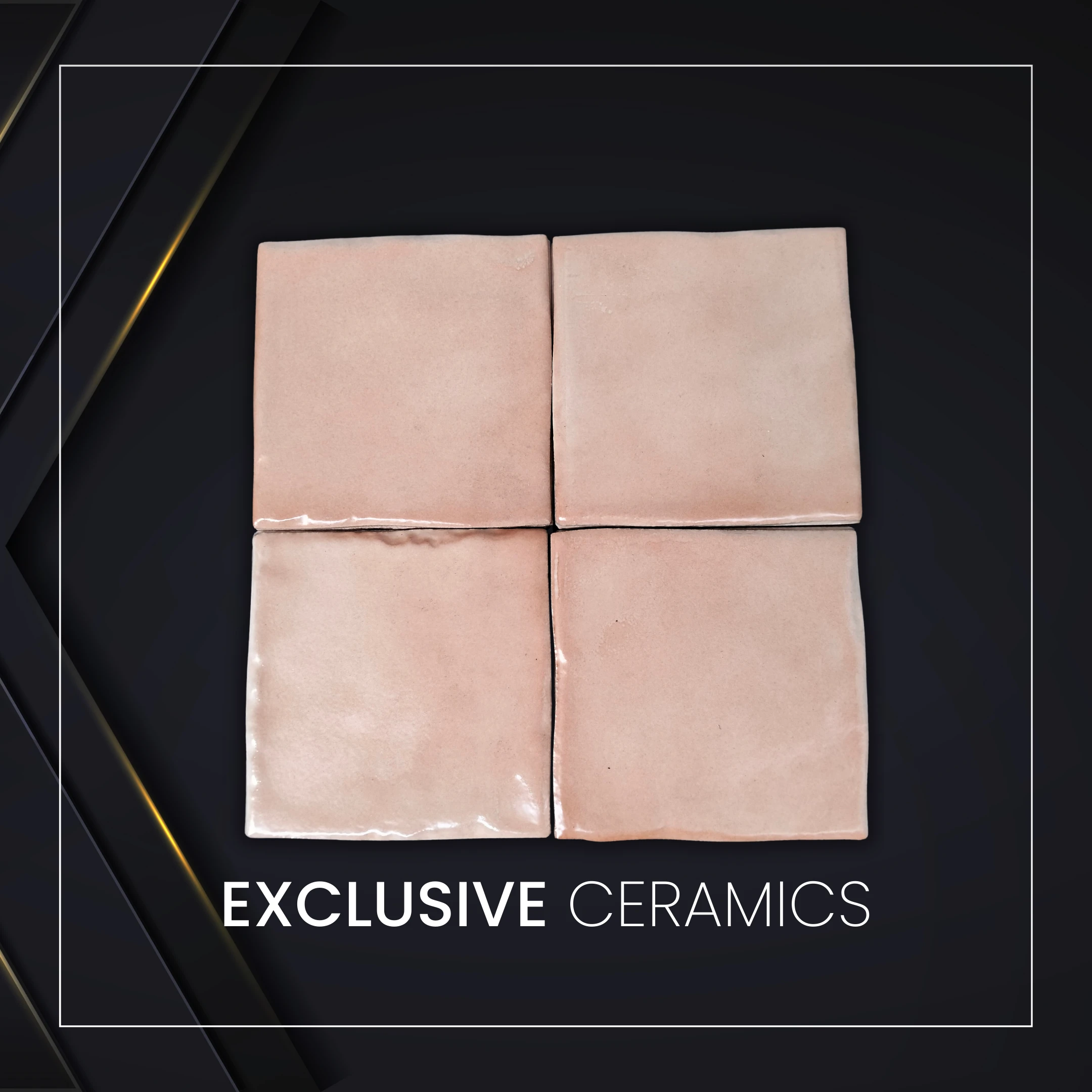
Tobago Rosato stands out with its wavy, contoured surface and med brown natural motif. Unlike flat tiles, this texture adds real depth once light hits the wall at an angle. Consequently, it works wonderfully as a feature wall behind an industrial-rustic coffee bar. Since the surface already has movement, it pairs well with minimal decor, letting the tile itself become the design statement.
Many boho and eclectic cafes use textured walls exactly like this to create a tactile, artisanal feel. In the end, Tobago Rosato fits spaces that want texture to do most of the visual work. View more here: Tobago Rosato 10×10.
5. Aruba
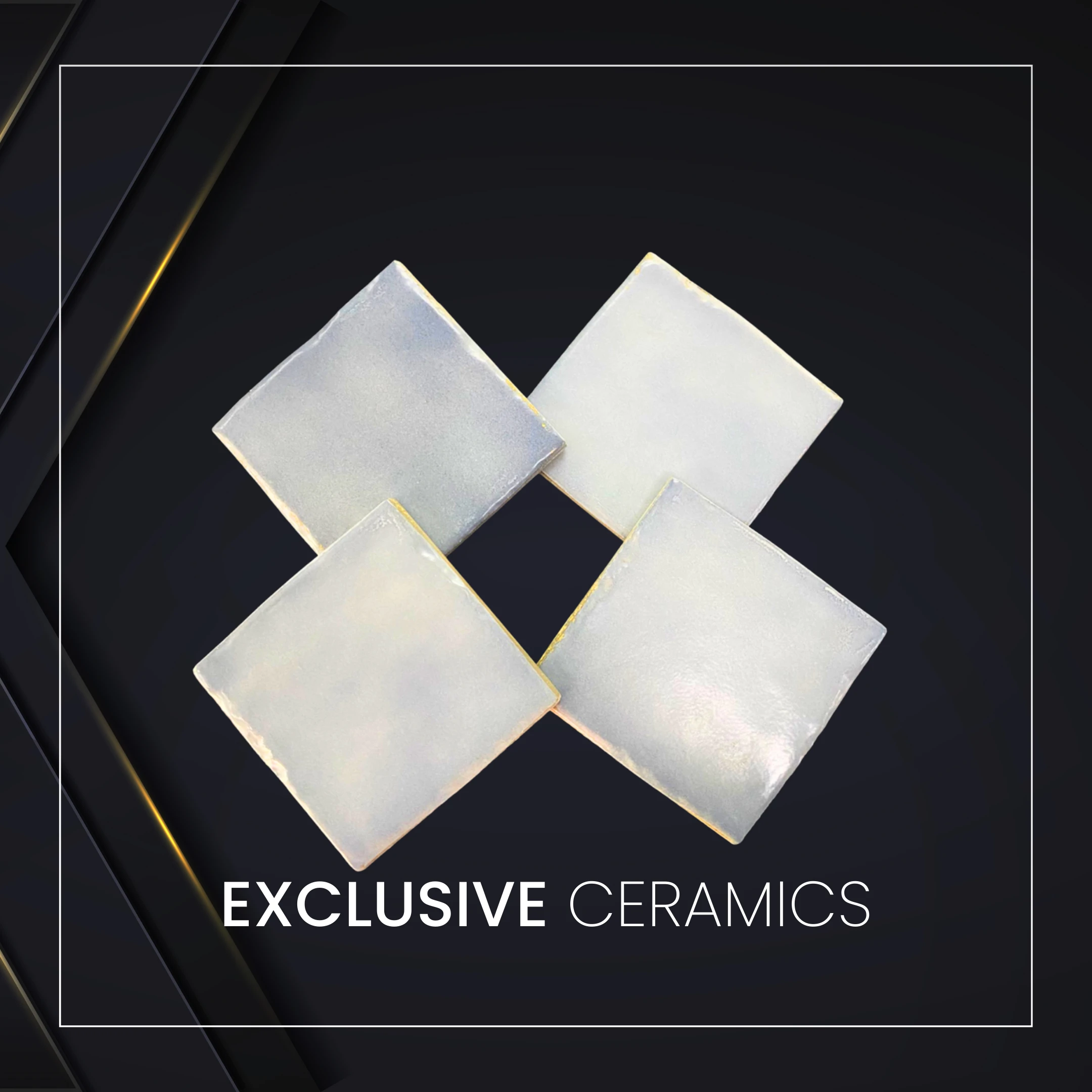
Aruba offers a stylish grey tone with a wavy, contoured natural motif. This finish suits sleek, modern industrial cafes that favor concrete, steel, and minimal color palettes. Because grey stays neutral, it blends effortlessly with black furniture, white cups, and warm pendant lighting.
Additionally, the textured surface adds subtle contrast against otherwise smooth, plain walls. Specialty coffee shops with a clean, editorial aesthetic often choose grey tones like Aruba for exactly this reason. Ultimately, Aruba works best for owners who want their 10×10 decorative mosaic tiles wall to feel modern, refined, and effortlessly cool. Discover the full details here: Aruba 10×10.
Interested in using 10×10 tiles for your home? Hurry up and buy them at Exclusive Keramik 10×10 right now through the WhatsApp button below!

Also Read: The Best 10×10 Ceramic Shower Tiles for Small Bathrooms
Kesimpulan
Choosing the right 10×10 decorative mosaic tiles comes down to matching color and texture to your cafe’s identity. Green and blue tones support a calm, natural mood, while terracotta and wavy textures bring warmth and character. Meanwhile, grey finishes like Aruba suit a sleeker, more industrial direction. Therefore, think about the story your cafe tells before picking a single tile. Once the tile matches that story, your space will feel intentional, memorable, and worth a repeat visit.